

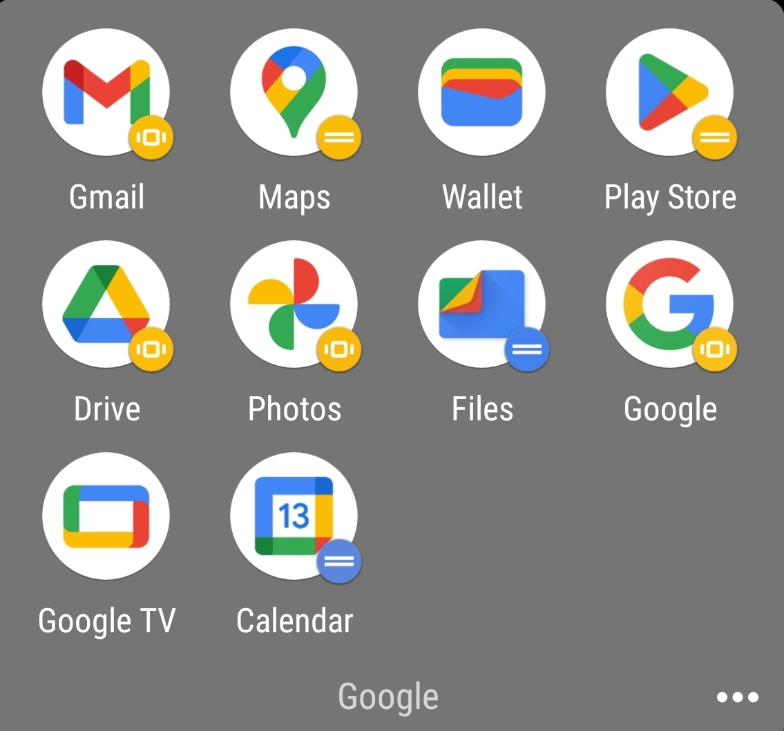
Counterpoint is the bullshit Google did with all their icons. Same exact colors with different shapes makes quick differentiation an actual challenge.
And then they introduced to android a new option that only showed the shape of the icon in two tones. Now they have no colour and are just odd shapes.
Why does Drive not match the color tone of the rest of them? It’s so muted.
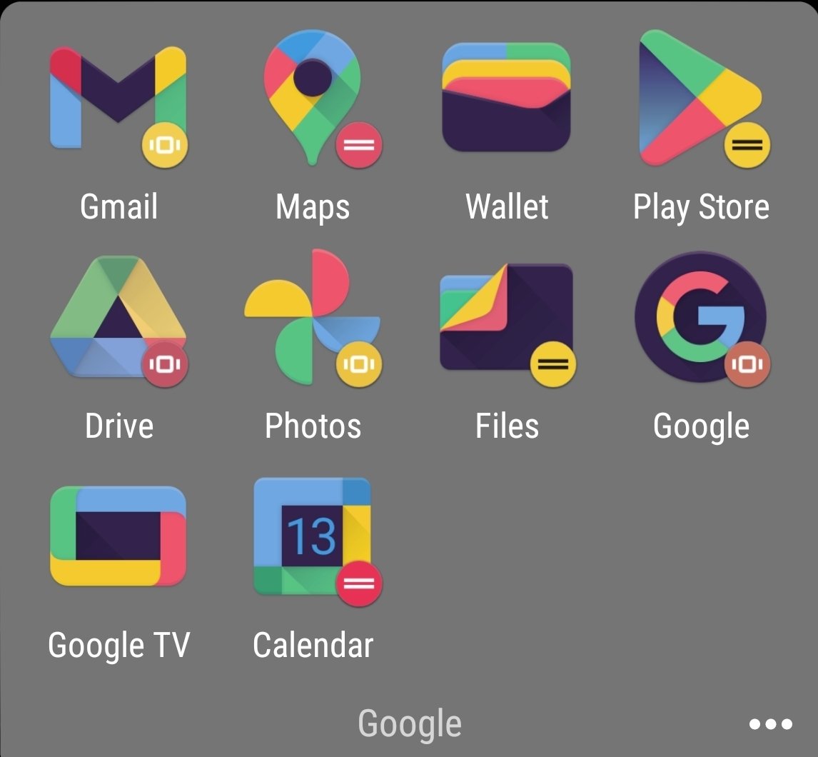
Those icons absolutely do not look normal, there’s some kind of theme being applied to all of them, likely a dark mode before it became a standardised feature, by the looks of it.
Although the icons are kinda not minimal with the amount of colors in there, they could have like made one app with one or two colors and the other with different ones
That’s gotta be an icon pack, given the black and the weird colors. Am I wrong? Did they change it since I last used the stock icons?
I forgot I had an icon pack on. Original is actually worse. No large silhouettes to work with.
Not disagreeing with you there. I wasn’t even much of an icon pack guy until they did the white circle thing. It looks so cheap
deleted by creator
I can’t tell you how often I’ve opened Google Drive when I meant to open the Gmail app or vice versa.
I know they technically don’t look that much alike, but at a glance they’re way too similar. Just use a different color for each app please?
