

And no, I will not tell you what my company app is.
You must log in or register to comment.
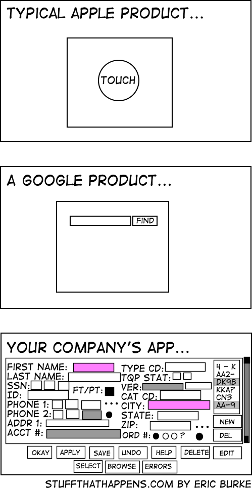
I hope that’s a power user app, right? RIGHT!?!
deleted by creator
deleted by creator
The honestly prefer the bottom one than the modern 50 step wizards that take 10 seconds for each page to load, and load an ungodly amount of JS scripts.
A company I worked for was using an ancient bug tracking tool (called Pivotal) that looked like a 90s site. It was so fast and responsive. Later, we moved to something modern. It was 10 times worse, significantly slower and overly complex.
Not really relatable, but if i file something complicated i prefer seing all options to fill in the blanks if i’m not too sure if it’s the correct information for the question.
So i rule out some and find the best fits until hopefully most if not all is correct, getting asked one at a time means i have to get it right and if some better fit comes later i have to go back many steps.
I hate when websites don’t have the username and password together. When you have to put in the username click ok then have some JavaScript hide the username prompt and prompt you for your password. Makes it more painful when trying to use a password manager. Especially one that isn’t built into the web browser by default.
KeePass autotype is amazing for these situations. Very customizable.
I agree that is an awful way to do things, but Bitwarden doesn’t seem to have a problem entering the username on one page and the password on another.
Yeah, Bitwardem is what I use. Just my little complaint about them doubling the steps to log in.
It’s called home realm discovery. It’s common in business apps though it’s usually used with email & password logins not username & password logins.
It’s done that way to support federated logins. Larger companies will often used a single sign on solution like Okta or Azure AD. Once the user’s email address is entered it checks the domain against a list of sign on providers for each domain and redirects the user to their company’s federated login if it finds it there instead of prompting for a password.
This has several benefits:
-
The user doesn’t have mutiple passwords to remember for different apps. Which is know to result in users either reusing passwords or writing down passwords somewhere.
-
When an employee quits or is terminated the company only needs to disable their account in their company directory and not go into potential dozens of separate web apps to disable accounts.
-
The software vendor never receives the password, if the vendor’s system is compromised they don’t even have password hashes to leak. (Let alone plain text or reversibly encrypted passwords)
Websites that work that way are (usually) doing it right. If that doesn’t work with your password manager, you should (probably) blame the password manager not the website.
I doubt the password manager is blame that there is now two steps to logging in compared to the previous one. The password manager still works, just requires using it twice. An annoyance because it used to be a little bit easier.
Thanks for all the info on home realm discovery. I love to learn new things!
If a website using home realm discovery adds anything more than one extra press of the enter key or mouse click of an ‘ok’ button, get a better password manager.
If you’re annoyed by that one extra click that’s fair. Click counts matter.
Purely minor rage about an extra click but thanks 🤪😄
-
Agreed. Everything on 1 page, submit, done. I had to use Workday at my last job and it was fucking atrocious trying to get anything submitted in because it was all step by step bullshit.
Fucking almost all of my jobs have used Workday. If so many companies are using it you’d think someone would have realized by now how awful it is.
Yea, it is one of the worst things I’ve ever had to use and I had to use it a lot. It wasn’t even supported by our IT team. Somehow HR went around them to implement it themselves. Which made it even worse because there were a shitload of problems at the start that any tier 1 help desk agent could have told them would happen if they’d bothered to ask for help.
The company app is for actual work, the others are for instagram and netflix
I worked for a big Euro bank for a bit and that was exactly it. JS timeouts were forbidden, so no animation to tell you something was finished, you had to keep clicking a Refresh button to know. In 2022.
And the colleagues who had been there a few years were actually defending this shit. Stockholm Syndrome is what it is. There wasn’t a day I didn’t complain about their piece of garbage of an intranet.
I’m so glad it’s behind me.We have to get permission from Marketing, the CEO, the Pope, and the ghost of Queen Elizabeth 2 to change anything about the layout, so we just jamb in more buttons.
Is this post brought to us by a Service Now developer?
Oh no, my company is going to integrate with Service Now! Should I be scared?
My condolences. ServiceNow is straight from hell. It’s ridiculously overcomplicated and the layout makes no sense and changes by the time you get used to its shittyness.
It will take literal months to get basic functionality implemented and it will never be pleasant to work with.
Fuck ServiceNow.
Also SAP can go fuck itself for the same reasons.
deleted by creator
Thanks although I have no control over what systems my employer chooses. I’m stuck with their crappy decisions.
You shouldn’t waste time being scared. Look for a new job now.
Depends did they hire 2 developers in house to babysit the application after rollout?
Nope…we have 4. Fucking Service Now.
4 so far right?
Haha, hire developers? No, no, no. Doesn’t off-the-shelf software just work? /s
Only if the price tag is big enough and the AI and copilot modules cost the same amount again per year.
Isn’t Service Now just help desk software? A ticketing system? I only know it from the user side, but it looks basic. What makes it shitty?
A lot depends on the implementation and how well the devs that worked on your instance did their job. Some stuff they built into ours works great and I appreciate those things. A lot of it is really half assed, inconsistent with other parts, and people who process things are nitpicky as fuck about actually doing it if you didn’t submit it just right (and they didn’t bother to validate inputs to make sure you do). Overall it’s slow and bloated AF when I’m trying to run reports which is mostly what I use it for.
Looks like Syteline to me lol.
Not too far off from my company. However, I work in Healthcare so we’ve got to do a lot of verification. Also, it’s more what we support for our customers rather than what users/patients should see. At least I hope.
Wrong, the google product is dead
And the Apple product would probable say “gloat about me to your friends”
And it was one they bought, just to kill it… Google: the sadist of the tech world.
I am getting flashbacks on dealing with SAP “inspired” software that looked worse than that bottom image. I am glad my new company does not use that garbage. It was especially depressing to see how SAP entirely ruined Concur.
But our power users!!
Ngl I prefer said company app rather than “new” stuff which runs on Electron and breaks just from looking at it
Fuuuuuuuuck Electron
At least it doesn’t have ads
CEO: “Now theres an idea…”
I mean, so many company overload there screens with button. I can understand why Apple and Google keep doing there thing.
I have to disagree. Removing features for the sake of simplifying things for the idiot masses frustrates me like no other. To this day I’m still upset over the removal of the Menu button in Android.
Also, love to be that guy: it’s their. I’ll never understand why people mix up their, there, and they’re so easily. Same goes for you’re and your. I realize that I’m being a dick but this shit is basic elementary school English.
Thank you for correcting me. I doing these mistake more and more, I don’t know why.
I also forgot the negation in my message but that’s a new level of mistake here!I think there is balance to have between founding where to click easily and allowing complexity in your functionality. To many UI mix together multiple functionalities making it hard to do one simple thing. For Google, it’s the opposite there is so little option on one screen that having a overview of what your doing is complicated : you feel lost when you try to do something new and you lost track of what you did when you try to do something complicated.
deleted by creator


